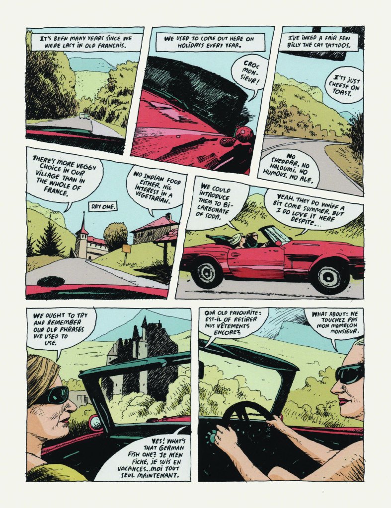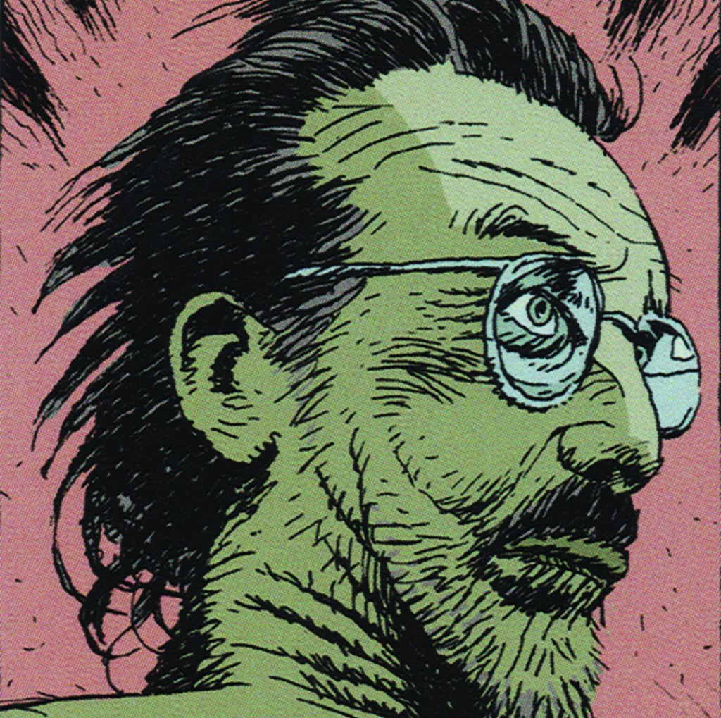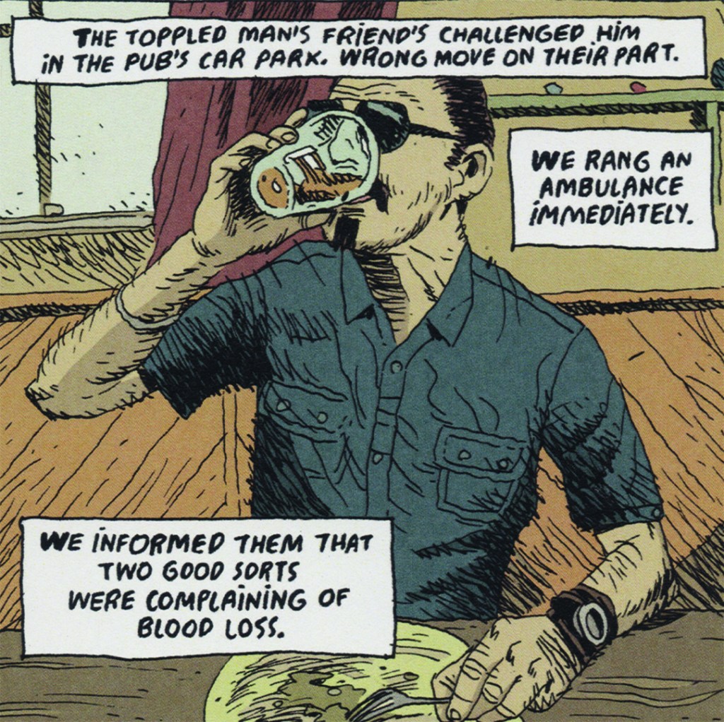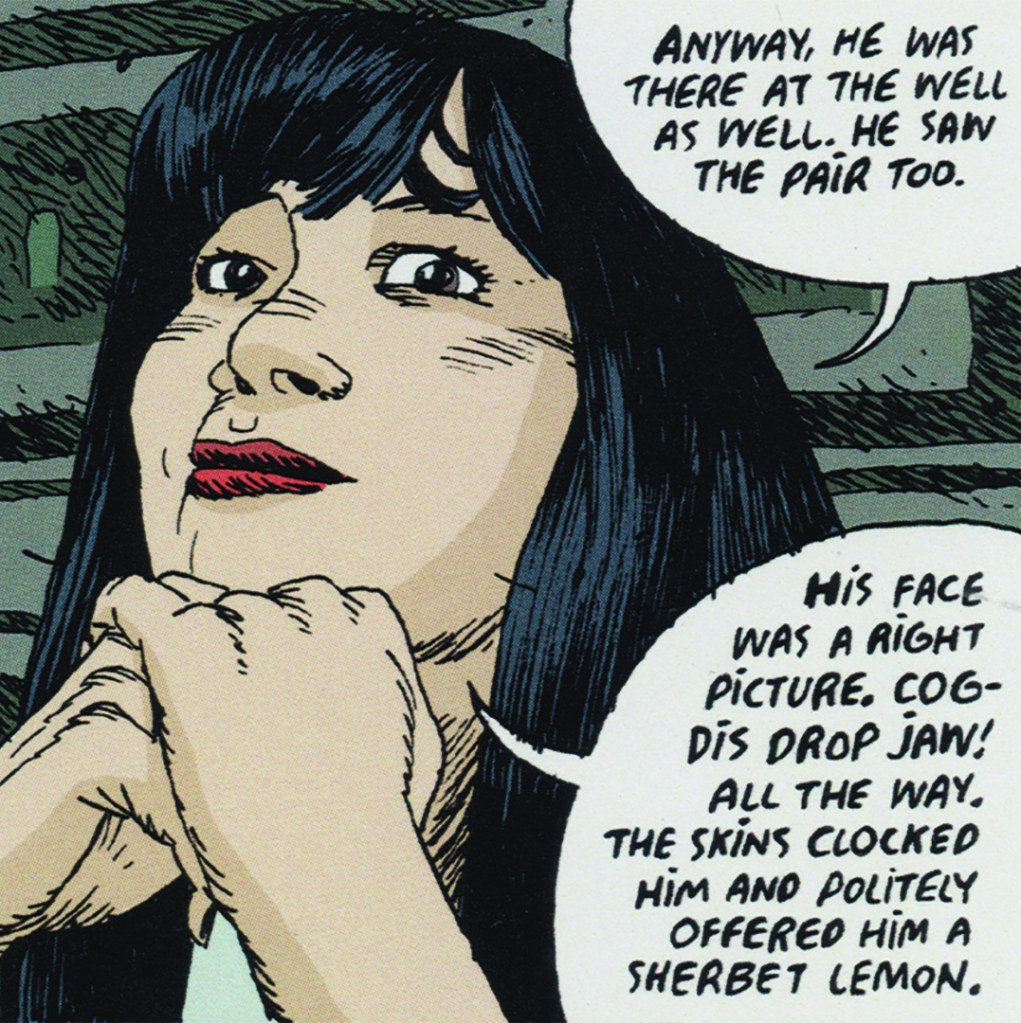
If you’re a fan of indie music and comic books, you’ll feel right at home in the warped world of THE CANCEL HAUS.
This critically acclaimed, very English, darkly comic thriller is funding on Kickstarter—but only for 5 more days.
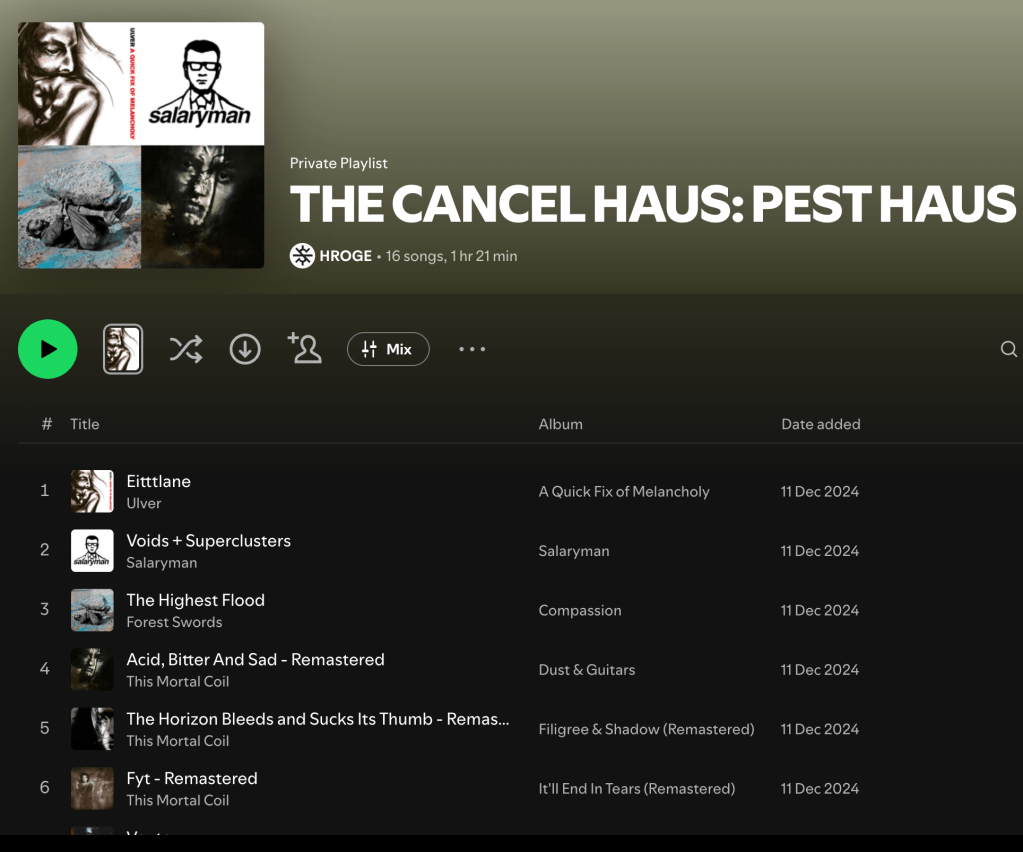
Indie music references are sprinkled through its pages and each printed version contains a specially curated playlist.
If you love art that feels handcrafted, uncompromised, and a bit too weird for the mainstream, you’ll vibe with The Cancel Haus.
Think of it as the graphic‑novel equivalent of a cult indie album: made by one creator, full of personality, and impossible to mistake for anything else.
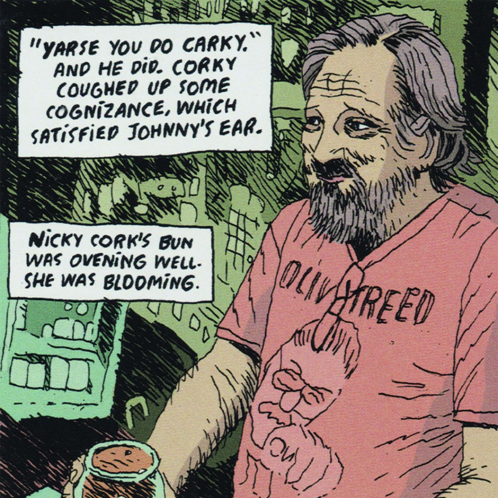
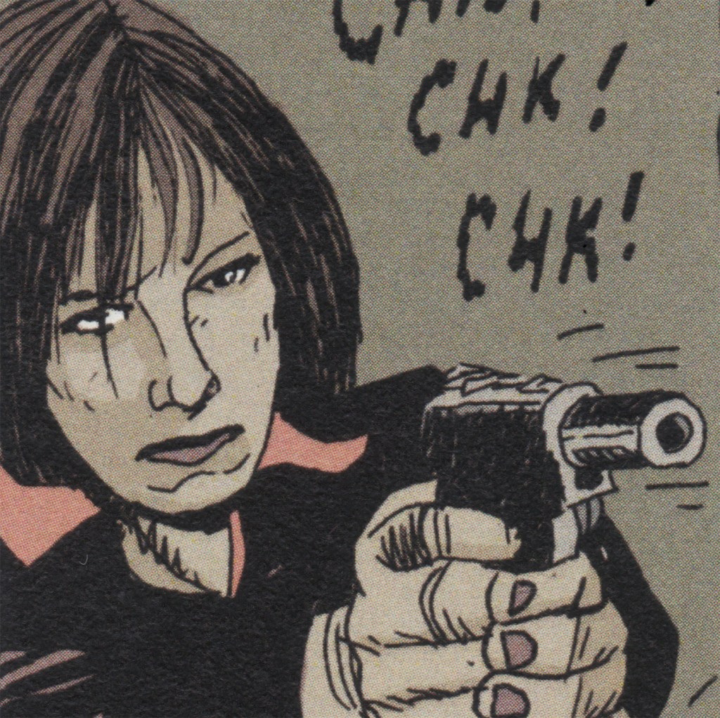
Created entirely by one artist over 15 years, THE CANCEL HAUS blends literary depth, visual flair, and a rebellious spirit. It’s been called “a masterwork in the making” and “a seminal moment in graphic novels.”
And here’s where the design heads lean in:
‘As well as the 24 pages of full colour artwork per issue, there are additional pages featuring quotations, lists of films and music playlists compiled by Hroge and mysterious design collaborator Esther, that act as almost supplementary indicators of influences and mood, and pull the whole thing into a very simple yet sophisticated overall design package, which suggest some serious proper thought has gone into creating a whole world for the reader to enter. It’s the small details like this that impress me; in its modest way it’s similar thinking to how each issue of the original Watchmen was a conceptual piece in its own right while being part of a bigger whole. Or the way Vaughn Oliver might design an album for 4AD.’ Paul Ashley Brown – Comics creator/Publisher
This is graphic fiction for the fearless — a world built with the same obsessive care as a cult record sleeve or a hand‑assembled zine.
Don’t miss your chance to be part of it.